Choosing Color Schemes for Your Facility’s Rooms & Furniture
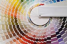
How to Choose Colors for Your Facility.
Choosing colors Schemes for your healthcare facility requires thoughtful consideration of various factors. Color influences mood, perception, and even behavior, making it a powerful tool for creating an environment that aligns with the purpose and function of the space. Here are some key points to consider:
Understanding Color Psychology
- Impact on Mood and Emotions: Different colors can evoke different emotions. For example, reds and oranges might be energetic, but blues and greens are typically tranquil.
- Cultural Significance: Consider the cultural connotations of certain colors in the context of your facility’s location.
- Target Audience: Consider the area’s user demographics. People of different age groups and backgrounds might have varied responses to colors.
Purpose of the Space
- Functionality: The color scheme should support the space’s function. For example, a hospital might benefit from soothing colors, while a gym might opt for more vibrant, energetic hues.
- Branding: If the facility represents a brand or organization, incorporating brand colors can reinforce identity and values.
Practical Considerations
- Size and Lighting: Lighter colors can make a small space feel bigger and brighter. The amount and type of light in a space also affect how colors look.
- Maintenance: Some colors show dirt or wear and tear more quickly than others, which is crucial for high-traffic areas.
- Trends vs. Timelessness: While trendy can make a space feel modern, it’s also essential to consider the longevity of the color scheme.
Integrating Color in Design
- Color Harmony: Choose a color scheme that ensures harmony and balance. This can be monochromatic, analogous, complementary, etc.
- Accent Colors: Utilize accent colors to add interest and depth to the space without overwhelming it.
- Textures and Materials: Remember that color isn’t just about paint. Consider how colors will work with the textures and materials in the furniture and fittings.
User Experience
- Accessibility: Ensure the color scheme is accessible to people with visual impairments. Avoid color combinations that are problematic for color blindness.
- Mental Well-being: Create a soothing or stimulating environment depending on the needs of the users of the space.
Experimentation and Feedback
- Samples and Mock-ups: Test paint colors and fabric samples in the actual environment to see how they look under different lighting conditions.
- Stakeholder Input: Get feedback from people who will be using the space.
Sustainability
- Eco-friendly Options: Consider how the paints and materials you choose will affect the environment. Opt for sustainable, non-toxic options when possible.
Remember, choosing colors for a facility is about creating a cohesive, functional, and pleasing environment. It’s a balance between aesthetics, practicality, psychology, and the space’s unique identity.
When it comes to color choices for furnishings for your facility, the psychology behind color may help guide your decision:
- Reds are known to stimulate adrenalin and cause feelings of excitement.
- Blues and Greens tend to create a calming effect. Studies have shown that blue can actually have the effect of lowering heart rate and blood pressure.
- Similar to blue, Purple is known as a calming color that can also stimulate creativity.
- Yellow is mentally stimulating, activates memory, and encourages communication.
- Brown can evoke feelings of stability – a connection to the Earth.
-Want to see how the fabric will look on a piece? Try a 3D visualizer and take the guess work out of choosing the color of the fabric.
-When needing to choose coordinating colors for multiple pieces, you may want to grab color wheel and look for color opposites to create a complimentary scheme or work with an experienced contract furniture company.
Get The Upholstered Seating CatalogueTopics: Interior Design Advice of Group Living Facilities

